
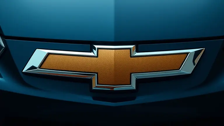
For over a century, the Chevrolet logo has stood as one of the most recognizable emblems in the automotive world. Often referred to as the “bowtie,” this simple yet powerful mark has evolved through decades of design trends, reflecting the spirit of American engineering and the shifting aesthetics of the road. As we look toward the next generation of vehicles, the brand is once again marking a transition, debuting a refined, horizontal version of this iconic symbol on the highly anticipated 2027 Chevrolet Sonic.
This evolution is not just a cosmetic refresh; it is a strategic repositioning designed to align Chevrolet’s global identity with a modern, digital-first aesthetic. By analyzing the trajectory of the bowtie—from its early 20th-century origins to its current, sleeker iteration—we gain a deeper understanding of how the company balances its storied heritage with the future of automotive innovation. Whether you are a dedicated brand loyalist or a design enthusiast, the shift in the 2027 Chevrolet Sonic design offers a fascinating case study in how heritage brands remain relevant in a rapidly changing market.
In this article, we will explore the visual history of the Chevrolet emblem, delve into the strategic motivations behind the new global rebrand, and examine how consumer sentiment is shaping the future of this classic icon. Join us as we track the bowtie’s journey from the classic chrome era to the minimalist standards of today, and discover what this change means for the future of your favorite automotive manufacturer.
The Evolution of the Bowtie: Chevrolet’s Global Rebranding Strategy

The iconic Chevrolet logo—widely recognized as the “bowtie”—is undergoing its most significant visual transformation in recent history. This branding pivot is part of a deliberate, long-term global rebrand initiative aimed at harmonizing the automaker’s identity across diverse international markets. While initial testing and rollout strategies gained traction in Brazil, the debut of the 2027 Chevrolet Sonic crossover marks the official introduction of this refined aesthetic to the United States market. By shifting toward a flatter, more horizontal bowtie geometry, Chevrolet is moving away from the traditional, bulky 3D-effect emblems of the past, embracing a minimalist design language that better translates to digital interfaces, electric vehicle badging, and modern showroom architecture.
Understanding the Strategic Shift
The transition to this streamlined aesthetic is more than a mere cosmetic update; it is a calculated effort to modernize the brand’s visual footprint. The new horizontal bowtie design reflects a broader automotive industry trend toward “flat design,” which enhances visibility on high-definition screens and integrates seamlessly into the front fascia of new vehicle lineups.
Key aspects of this global modernization effort include:
- Strategic Consistency: Aligning visual assets globally to ensure the Chevrolet brand identity remains recognizable from South America to North America.
- Streamlined Geometry: Reducing the depth and contrast of the logo to emphasize cleaner lines, which complements the aerodynamic profiles of the latest 2027 Chevrolet Sonic design.
- Future-Proofing: Optimizing the mark for digital versatility, ensuring the logo retains its impact when displayed on mobile apps, navigation systems, and social media platforms.
As the automotive sector shifts toward electrification and highly integrated tech-forward interiors, the evolution of the bowtie emblem serves as a bridge between Chevrolet’s storied heritage and its future-focused trajectory. Consumers and enthusiasts alike are viewing this change as a signal that the brand is prioritizing digital-first design principles, ensuring the Chevrolet bowtie remains as relevant in the coming decade as it was during the company’s inception.
Visual History: A Century of the Chevrolet Bowtie

The iconic Chevrolet logo, widely recognized as the “bowtie,” remains one of the most enduring symbols in automotive history. While the exact origins remain a subject of debate—often attributed to a wallpaper pattern Louis Chevrolet saw in a French hotel in 1914—the emblem has served as a consistent touchstone for American engineering. Over the past century, the bowtie has undergone subtle refinements to mirror the changing aesthetics of the automotive industry, evolving from the stark, industrial look of the early 20th century to the sleek, modern branding seen today.
Key Evolutionary Milestones
The trajectory of the Chevrolet bowtie reflects the brand’s shift from a utility-focused manufacturer to a global leader in design. Significant iterations include:
- 1914–1950s: The logo began as a simple, elongated shape, often featuring the brand name in a bold, serif font to establish corporate identity.
- 1960s–1980s: As aerodynamics became a priority in vehicle design, the logo adopted cleaner, more geometric lines, eventually transitioning to the classic “gold” finish that became synonymous with the brand’s reliability.
- Modern Era (2000–2025): The brand adopted a three-dimensional, chrome-bordered appearance to emphasize structural depth and high-tech manufacturing quality.
The New Global Standard
The most recent chapter in this visual evolution arrives with the debut of the 2027 Chevrolet Sonic crossover. This iteration features a distinct, more horizontal bowtie design, marking a move toward minimalist digital-ready branding. First introduced as part of a global rebrand originating in Brazil, this update signals a transition toward simplified, high-contrast emblems that translate more effectively across digital platforms and electrified vehicle grilles. By embracing this horizontal geometry, Chevrolet effectively aligns its historic heritage with a forward-looking design language, ensuring the brand remains instantly recognizable while feeling contemporary in an increasingly competitive US market.
Spotlight on the 2027 Chevrolet Sonic Design

The 2027 Chevrolet Sonic crossover represents a pivotal shift in the brand’s visual identity, serving as the primary vehicle to debut the new Chevrolet logo. By adopting a more horizontal orientation of the iconic bowtie, Chevrolet is signaling a transition toward a sleeker, more modern aesthetic that aligns with its global rebrand initiative. This design evolution is not merely a cosmetic update; it is a calculated integration of heritage and future-facing minimalism. The emblem sits prominently on the front fascia, creating a cohesive visual anchor that draws the eye toward the vehicle’s refined grille architecture and updated LED lighting signatures.
Design Integration and Aesthetic Impact
The placement of the refreshed Chevrolet logo on the 2027 Sonic highlights a departure from the thicker, more vertical proportions seen in previous decades. This adjustment serves several key design objectives:
- Front Fascia Cohesion: The wider, flatter profile of the bowtie integrates seamlessly with the sharper, more aerodynamic lines of the Sonic’s front end.
- Modern Branding: By shifting toward a horizontal design, the brand creates a lower visual profile, which enhances the perception of width and stability on the road.
- Strategic Visibility: The new emblem is engineered to stand out against the backdrop of the modern, intricate grille patterns that define the current 2027 Chevrolet Sonic design, ensuring brand recognition remains high even as the vehicle silhouette evolves.
Industry experts note that this transition began in the Brazilian market before reaching US shores, confirming that the new bowtie is a core element of Chevrolet’s global modernization strategy. By embedding this change within the compact crossover segment, Chevrolet is testing its new design language on a high-volume platform. This approach ensures that the updated Chevrolet logo is associated with efficiency and innovation, rather than just luxury, effectively bridging the gap between historical brand loyalty and the contemporary demands of the automotive market.
Public Perception: Consumer Reactions to the Horizontal Design Shift

The introduction of the updated Chevrolet logo on the 2027 Chevrolet Sonic has ignited a spirited debate across automotive enthusiast forums and social media platforms. As the brand transitions toward a more horizontal, elongated bowtie design—a visual shift that originated in the Brazilian market before reaching the US—public reception has been notably polarized. The redesign represents a clear pivot toward a minimalist, global-forward aesthetic, moving away from the more traditional, thicker proportions that have defined the brand’s identity for decades.
The Divide: Traditionalists vs. Modernists
Automotive enthusiasts remain deeply divided regarding the evolution of the bowtie. Analysis of current forum sentiment highlights two distinct camps:
- The Traditionalist Perspective: Long-time brand loyalists argue that the classic bowtie proportions are iconic and synonymous with Chevrolet’s heritage. Critics of the horizontal shift suggest the new design appears less “substantial” and risks losing the distinct, recognizable character that historically differentiated Chevy from global competitors.
- The Modernist Perspective: Conversely, proponents of the new design view the horizontal tweak as a necessary evolution for a digital-first era. Supporters appreciate the cleaner lines, noting that the flatter profile integrates more seamlessly into modern, high-tech vehicle grilles and aerodynamic fascias.
Beyond the aesthetic debate, there is significant interest in how this branding change impacts the aftermarket community. Owners of previous models, such as the 2026 Colorado, continue to utilize search terms for the Chevrolet logo to source accessories or personalization kits, suggesting that regardless of the 2027 redesign, the brand’s badge remains a focal point for consumer customization. Whether this shift succeeds in the long term may depend on how effectively the horizontal design complements the future lineup of electric and crossover vehicles, balancing heritage with the demands of a modern global market.
Crafting Excellence: Master Your Own Custom Garage Projects
The evolution of the Chevrolet bowtie serves as a compelling reminder that precision in design defines how we perceive quality. Just as the 2027 Sonic refresh prioritizes clean, intentional lines to achieve a modern aesthetic, your own workshop projects demand the same level of rigorous planning and execution. Whether you are creating custom garage displays, modifying vehicle interiors, or crafting bespoke automotive accessories, the difference between a prototype and a masterpiece lies in the accuracy of your blueprints.
For the dedicated enthusiast looking to bring professional-grade precision into the home workshop, trial-and-error is no longer an option. That is why we recommend Ted’s Woodworking—the ultimate resource for creators who refuse to compromise on quality. With access to a vast library of 16,000 workshop-tested plans, you can eliminate the guesswork from your projects, ensuring that every cut, joint, and measurement aligns with the high standards of a pro-level finish. It is the perfect bridge for hobbyists who want to translate their appreciation for automotive design into tangible, high-quality builds.
Ready to build your own custom garage features or automotive-inspired projects? Get instant access to the complete library of 16,000 workshop-tested plans here.
 Ready to build your own custom garage features or automotive-inspired projects? Get instant access to the complete library of 16,000 workshop-tested plans here.
Yes, I Want This Now!